Part of what makes us human is prioritizing our physical and mental health and seeing our growth over time. Thrive re-imagine fitness apps to be holistic, inclusive for all walks of life, and data-driven to show progress. I created Thrive with Figma from the ground up, where I took on the UX researcher and UX/UI designer roles.
Before doing a deep dive into my project, I want to share my design framework, which has the following five stages as seen below. This framework helps me see the bigger picture from the start, stay organized, use critical thinking skills, and never lose sight of user-centeredness throughout the design journey.

Furthermore, an example of how I leverage my unique perspective from health to the UX field is translating a clinical framework called the Evidence-based Practice Framework during the Discovery stage. This framework helps clinicians develop patient-centered treatment plans by equally considering clinical research and data, their own professional expertise, and patient's values and preferences. Similarly, I combine background/market research, my own professional and personal experiences, and user research to strongly understand my users.
.svg)
Throughout my bachelor's and master's working in the clinical space, I have noticed the following exercise-related problems, which inspired me to design a mobile fitness app.
1) Many people lose motivation to continue their fitness journey in the long term.
2) Many fitness apps are targeting to the young and already somewhat fit individuals who are trying to get more fit. Unfortunately, they do not address people who may be slightly older or have a previous injury history.
I conducted market research to see if surveys, articles, and academic literature also justify the need for an app addressing the problems I mentioned earlier.

1) Because everyone cares about their health and mobile app usage is increasing, creating a mobile fitness app is beneficial for both the users and the business stakeholders.
2) User research needs to be conducted to see how I can help remove motivational barriers for marginalized groups to use a fitness app.
3) Thrive needs to stand out both from its features and medical benefits. Otherwise, there is no solid justification for creating Thrive.
There is no one correct fitness goal because everyone's goals vary. In the same way, I wanted to be inclusive and as diverse as possible with my target users criteria. The criteria were:
1) Between 18-64 years old. I selected this age range since adolescent and geriatric fitness are more niche than the general adult age range. This way, the range is large enough to be inclusive but not too niche.
2) Individuals with different physical and mental fitness interests. I kept the fitness goals broad to be inclusive.
3) Individuals interested in using virtual tools like a web or a mobile fitness application. It felt reasonable that users being interviewed should display enthusiasm for using an app as the medium to help achieve their fitness goals.
On top of wanting to remove motivational barriers to exercise, I conducted user interviews to deeply understand what attracts users to using a fitness app in the long run. The interviews were semi-structured with open-ended questions and follow-up questions and were conducted via Zoom with 5 users. Overall, I was looking for common answers amongst the users. I considered it a significant insight if there were at least 40% or more similar responses.
Finally, the main open-ended questions were:
1) What do users want to see, experience, and expect from a fitness application?
2) Are the users engaging in an exercise plan? If so, what type of exercise plan are they engaging in and why?
3) What are users' thinking processes and emotions about motivators for and demotivators from using a fitness application?
4) What are users' thinking processes and emotions about motivators for and demotivators from engaging in exercise?
5) Do users feel that a fitness application can create an exercise plan for individuals with various chronic and medical conditions or accessibility needs?
During the user interviews, I took notes on what the users were saying, how they were feeling, and what methods worked well in the past and what didn't. Then, I synthesized the information I had gathered by identifying common patterns and keeping a tally of them in a table. Doing this led to the following user insights.

“Emotional barriers to exercise have always been a struggle for me if I don’t lose weight. I have seen mental health specialists about it, and it helps, but it sucks to see that almost no apps have any meaningful mental health component. I feel like they don’t really care besides your physical health.” - Quote from a user
“My biggest demotivators for engaging in fitness are not knowing my growth and plateauing. I used to write my progress on a notepad app, but when I wrote too much over a long period, I started deleting old data to make room, but now I don’t know if I made progress. Also, if I start plateauing, I want the app to tell me that I should try a different type of exercise.” - Quote from a user
1) Data Visualization. A large majority of users want to see their progress over time in an understandable way, such as via line charts, bar charts, etc.
2) Effortless Experience. A large majority of users want instructions for activities to be short and clear, and manual inputs should be minimal such as the number of reps they completed.
3) Include Mental Health. Many users believe that a fitness app should emphasize how to overcome the emotional barriers to exercise.
4) Inclusive Plans. Many users want customized plans based on their needs and believe that plans should be inclusive despite their age, fitness level, and injury level.
5) Flexible Plans. Many users want their plans to be flexible in case they miss out on a scheduled exercise day or if they need to adjust the difficulty.
6) Access to Education. Some users want to become more well-versed in fitness, health, self-care, and nutrition.
7) Activities Recommendations. Some users want the app to provide them a list of recommended activities based on their goals and progress.
8) Variety of Activities. Some users want the app to have a variety of activities to increase engagement.
To make the design more humanistic and put faces to who I am designing for, I constructed 3 personas. Creating personas can be helpful when communicating to stakeholders about how Thrive can help subgroups of customers. These personas represent what I learned during the market research and identifying insights from user interviews.
.png)
.png)
.png)
After learning about the market and my users, I contemplated how Thrive could attract new users and keep users highly satisfied. I also considered how Thrive could incentivize business stakeholders to invest in the app to help it grow. Therefore, having a vision of how Thrive would meet user and business-focused goals forms a general foundation that leads nicely to the next stage of developing a design strategy.

Earlier I mentioned that I haven't seen meaningfully holistic apps. I wanted to confirm this through a competitive analysis. I also wanted to do a competitive analysis to identify my competitor's strengths and weaknesses to form a general blueprint of what Thrive could be like, and fill a gap in the market. I was able to find direct competitors like BeachbodyOnDemand and FitON that are focused on physical fitness content. I also considered direct competitors like Headspace for its focus on mental health content.

Based on the market research, users' insights, my vision of Thrive, and observing my competitors, I began forming an idea of the architecture of Thrive. I translated these ideas into a sitemap to create a logical and seamless experience for my users. I created this sitemap knowing that Thrive may not exactly look like my first sitemap draft after multiple iterations through the design journey.

Next, I wanted to dive deeper and better understand the overall journey my users would be taking throughout the app from start to finish. So, I selected one of my persona, Harmony, to better empathize with the scenario she may be in and the different decisions she would be making. To do this, I created a user flow to step into Harmony's shoes.

I used my ideation stage to make an informed decision on how to design Thrive. First, I started with paper wireframes by sketching 2 to 5 versions for each page and then combining components I liked from each to make a final version. Next, the paper wireframes served as a reference to create the digital wireframes. Finally, I created a low-fidelity prototype from the digital wireframes. This would help me quickly test the design on real users and make any priority revisions before integrating the branding and visual design.


To evaluate the efficacy and clarity of Thrive, I conducted 2 usability tests. The users were asked to share what they were doing, thinking, and feeling while interacting with the prototype and trying to complete the tasks given to them. The first test consisted of 4 participants who helped inform the necessary changes from the low-fidelity prototype to the high-fidelity mockup. The second test consisted of 5 participants who helped inform the desired touch-ups from the high-fidelity mockup to the final product.
Method: Remote, Moderated usability testing
Participants: 4
Age range: 18 to 64 range
Marginalized groups: 2 of 4 are less familiar with the use of technology; 2 of 4 are less fluent in English; 2 or 4 have a complex medical or injury history.
# of Tasks: 14
Error-Free rate: 79%
Task completion rate without guidance: 94%
Method: Remote, Moderated usability testing
Participants: 5
Age range: 18 to 64 range
Marginalized groups: 2 of 5 are less familiar with the use of technology; 2 of 5 are less fluent in English; 2 or 5 have a complex medical or injury history.
# of Tasks: 13
Error-Free rate: 85%
Task completion rate without guidance: 95%
Error-Free rate improvement since Test 1: 7.59% increase
Task completion rate without guidance improvement since Test 1: 1.06% increase
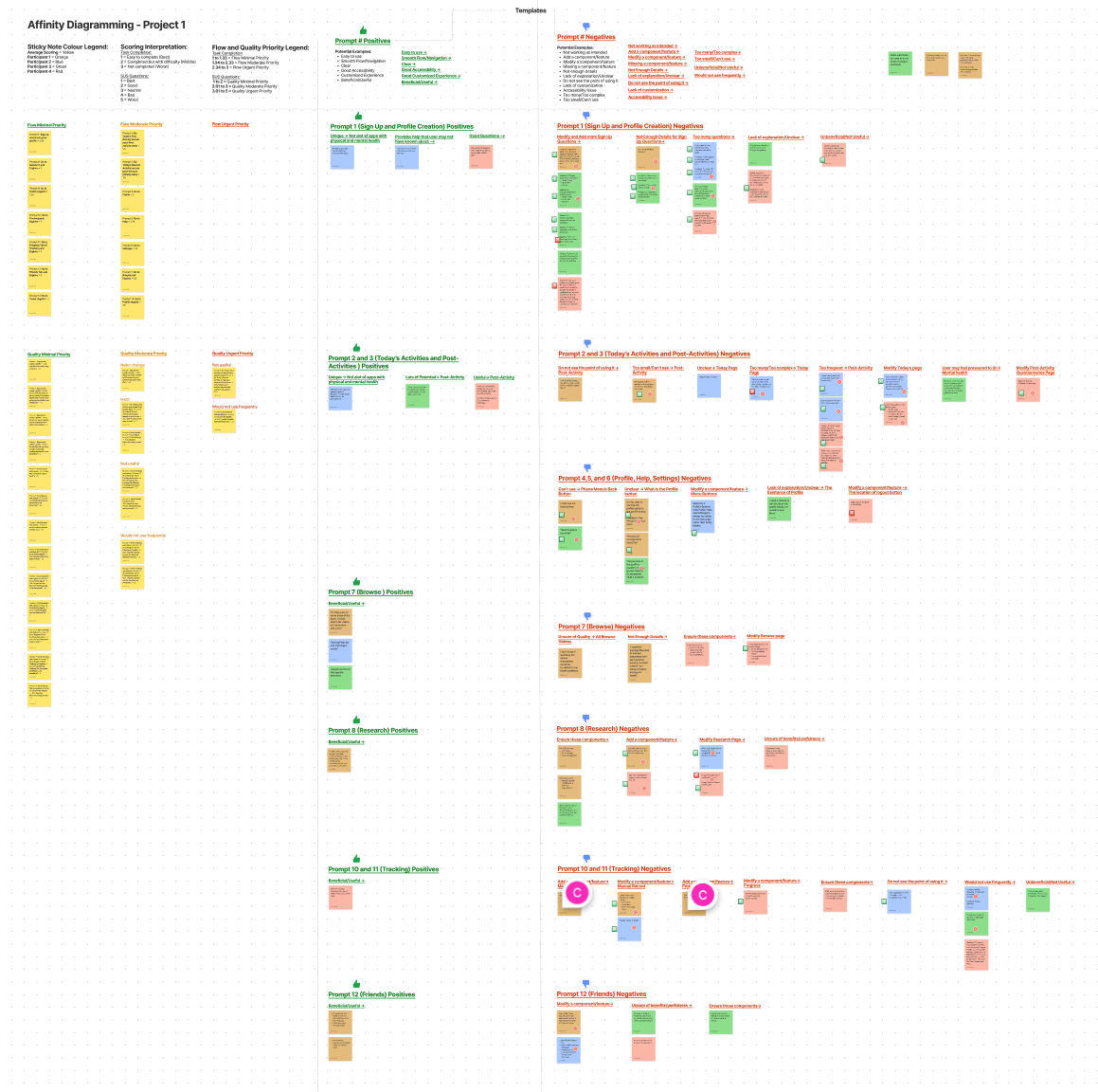
To synthesize my findings from testings, I took all my notes and observations and created an affinity map. I used the affinity map in the following ways.
1) Flow Priority For each task, I graded the participant [1 = Completed with ease // 2 = Completed but with difficulty // 3 = Incomplete]. I took the average scores across all participants, so tasks with scores closer to 3 were deemed a higher priority to fix.
2) Quality Priority For each task, I asked quality-based questions like 'Did you find this task beneficial?' and 'Does this task align with what you want?'. The participants gave me a score from 1 to 5 [1 = Strongly agree = Best answer // 5 = Strongly disagree = Worst answer]. I took the average scores across all participants, so tasks with scores closer to 5 were deemed a higher priority to fix.
3) Common Qualitative Feedback I would also ask open-ended questions like 'Describe how you would change this task if applicable.' I grouped common answers within each task. I considered it a significant insight if there were at least 40% or more similar responses.
When I was iterating my prototype, I considered the occasional outlier feedback if I felt that the user who said it made a strong justification for it. But, for most cases, I grouped common patterns within a task and across all tasks to identify the underlying missing pieces preventing Thrive from being a better product. As mentioned before, I considered it a significant insight if there were at least 40% or more similar responses.

1) Unclear skipping
Being unaware that some of the post-activity surveys were skippable led to frustrations. Thus, I increased the skip button's size, increased the contrast with the background, and wrote "Optional" as part of the pages' titles that were skippable.
2) Some features are too hidden
Being unaware that the settings and help features are found after pressing the profile button led to frustrations. Thus, I created a side menu button on every screen so users can access all major features.
3) Manual tracking lacks incentive
Users felt manual data recording to be both tedious and missable. Thus, I emphasized that the manual recording is "Optional," and I plan on working with the engineers to embed a pop-up reminder feature for manual recording.
4) Friends page lacks incentive
Users felt that there are potentially better social media app alternatives. To compete with social media alternatives, I added features to make users feel more part of a community via chat, joining groups, and following fitness-related influencers for wellness tips.

1) Too much scrolling
Users found navigating many pages difficult because too much scrolling was involved. Thus, I decreased the size of the video tiles and removed unnecessary negative space.
2) No feature for seeing and editing full plan
Users felt that being able to see and edit their full plan is a necessary feature of the prototype. Considering that customizability is a selling point for Thrive, I agreed. Thus, I added a “See/Edit My Full Plan” button on the side menu and the Hub page to make it more noticeable.
3) No feature for substituting recommended activities
Users felt that being able to substitute recommended activities is a necessary feature of the prototype. Considering that flexibility is a selling point for Thrive, I agreed. Thus, I added a "My Library” button on the side menu.
4) Unclear icons
Users found navigating difficult because not all icon buttons had a written description underneath them. I considered this an accessibility need, so I added a text description for all icons.
While going through my design framework, implementing accessible and intuitive design was a strong priority to ensure that Thrive was inclusive and useable, which benefits the user and business goals. It is also important to highlight that because this was an independent project, it was not possible to do usability assessments with multiple people.
In light of all this, the following are what I implemented for Thrive.
1) Colour Contrast
The minimum contrast ratio between the foreground and the background colour is 4.5:1 to ensure that the colour use is accessible (WebAIM, 2022; World Wide Web Consortium, 2016). Therefore, I checked the ratio for each combination of foreground and background colours used in Thrive via WebAIM. These colour combinations were equal to or greater than the minimum 4.5:1 ratio.
2) Animation Speeds
Animations are recommended to be between 150 to 500 milliseconds (ms) to be accessible for people with cognitive disabilities (Google, 2022a). Thus, Figma's prototype presentation's motions used to navigate Thrive fall between 150 to 500 ms.
3) Legibility
The typical accessible typography size is between 16 pixels to 18 pixels across various reputable sources (Penn State, 2021; W3 Lab, 2019; World Wide Web Consortium, 2016). Thus, I selected my default body text size to be 17 pixels.
4) Landmarks and Hierarchy
Having landmarks such as the search bar, header, footer, and side menu let screen readers pick up on these sections, which improves accessible navigation (Google, 2022b). The logic is the same for using different Heading types such as Header 1, 2, 3, and 4 (Google, 2022b). Thus, I followed these guidelines when building this project.
5) Diverse Media
Thrive aims to serve individuals with diverse goals, such as using the app for bodybuilding, improving their cardio, and engaging in mental health activities. Thrive also aims to help individuals no matter their age, experience level, injury, and medical history. For these reasons, I used media like avatar pictures that best reflected these diverse users within what was available from public domain websites.
6) User Control and Freedom
While only the main flow of Thrive was designed, I incorporated a smooth way to transition back and forth between pages. Providing users with control and freedom improves usability (Wong, 2022).
7) Limited Memorization, Consistent, and Minimal
Limiting the need to memorize components of an app is crucial for people with cognitive disabilities since they have limited working memory, but everyone can benefit from this as well (Wong, 2022). Thus, to reduce cognitive overload, it was critical to make the app consistent and minimize redundancies (DaCosta & Seok, 2010). Thrive's 5 users ranked how consistent Thrive is [1 = Very consistent; 5 = Very consistent], and the average score was 1.4, which is a great indicator for Thrive's consistency. Next, the 5 users ranked how simple and easy it is to use Thrive [1 = Very easy; 5 = Very hard], and the average score was 1.4, which is a great indicator that Thrive requires little cognitive load.
8) Improved comprehension through notification/feedback and simplicity
Users need to know what is going on and get appropriate and simply worded feedback during their interaction because people with cognitive and learning disabilities may be confused by unclear error messages and unexpected behaviour (Abou-Zahra, 2019). Moreover, notification and feedback improve usability which benefits everyone regardless of their digital skill (Abou-Zahra). For these reasons, when the user is located on one of the 5 main pages (Hub, Activity, Learn, Tracking, Friends), one of the respective navigation buttons changes its colour to indicate the visibility of where they are. Also, when users complete their Today's activity, the activity image is marked with a checkmark to visually indicate completion.
Typically, collaboration with engineers starts at the kick-off to define the scope and timeline, understand the high-level architecture for the future product, and discuss technical feasibility. Unfortunately, this wasn't possible because Thrive was an independent case study.
With that said, collaboration with engineers and other designers is crucial to building a better product, so I created a design system to promote consistency.
After many hours of researching, thinking, and iterating, I created the final prototype that I am proud to share with you.
Overall, Thrive makes users feel like their fitness needs are being met holistically, their progress is visualized meaningfully, and the app is multi-faceted.
“Overcoming emotional barriers to exercise was one of my biggest struggles with other fitness apps. I like how this app has a 50-50 emphasis on physical and mental health.” - Quote from a user
“My main attraction to this app is the Tracking page. This is the most 'techy' of all the pages. I'm glad that the app's approach is both holistic and 'techy'. I like how on the Tracking page, there is a very comprehensive breakdown of my progress.” - Quote from a user
“The app's core is the Hub page, Activity Page, and Tracking page. Considering that you also have the Learn and Friends page, the app is really multifaceted in ways that I haven't seen before with other fitness apps. This app has so much potential!” - Quote from a user
This was my first end-to-end UX design project that allowed me to gain a thorough understanding of research, design, testing, and continuous iteration. I initially chose to create a reimagined fitness app because my clinical experience showed me that the lack of motivation and inclusivity were the notable flaws in most fitness apps. In the end, I am glad that I had this opportunity because I wouldn't have known without user research that holistic content and progress data improve motivation for fitness. I am confident that Thrive has a lot of potential to succeed in the market because there are limited fitness apps that are truly holistic and inclusive, so I am looking forward to seeing how my project evolves in the future.
Overall, the lessons learned from this experience are the following:
1) Continue to approach research and collaboration with users in mind
As mentioned in the My Framework section, I learned to review clinical research and treat patients as experts in their own lives to meaningfully collaborate with them when designing treatment plans.
I believe there is much value in this approach so I want to approach UX with a similar mindset. I yearn to continually learn and hone my research methodology skills and to form a 50-50 partnership with users to create a user-centred design. For example, I would continually ask open-ended questions, ask clarifying questions, summarize what users are saying, and create personas to best reflect the thoughts, feelings, and motivations of my users.
2) Balance between user and business needs
It can sometimes get tricky balancing user and business needs and not sway too much to one end. Thus, creating a Venn diagram as I did in the discovery stage helped me see how design decisions like making a highly customized experience can attract users and thereby increase revenue.
3) Perform competitive analysis with at least 5 competitors
Towards wrapping up Thrive, I felt that I could have made more intelligent design choices if I had referred to more than 3 competitors in my competitive analysis. In the future, I want to aim to research between 5-7 competitors to expand my knowledge while balancing time and cost.
4) Tradeoff between quality and cost
I learned that a project could never be entirely "done" because there's always another idea. However, I learned the importance of balancing between time, cost, and quality constraints.
Alturki, R. M., & Gay, V. (2016). A systematic review on what features should be supported by fitness apps and wearables to help users overcome obesity. International Journal of Research in Engineering and Technology, 05(09), 197–206. https://doi.org/10.15623/ijret.2016.0509032
Ceci, L. (2022, March 22). Topic: Health and fitness apps. Statista. Retrieved May 28, 2022, from https://www.statista.com/topics/9204/health-and-fitness-apps/#dossierKeyfigures
Harries, T., Eslambolchilar, P., Rettie, R., Stride, C., Walton, S., & van Woerden, H. C. (2016). Effectiveness of a smartphone app in increasing physical activity amongst male adults: A randomised controlled trial. BMC Public Health, 16(925), 1–10. https://doi.org/10.1186/s12889-016-3593-9
Higgins, J. P. (2016). Smartphone applications for patients' health and Fitness. The American Journal of Medicine, 129(1), 11–19. https://doi.org/10.1016/j.amjmed.2015.05.038
Shaban, H. (2021, January 8). The pandemic's home-workout revolution may be here to stay. The Washington Post. Retrieved May 28, 2022, from https://www.washingtonpost.com/road-to-recovery/2021/01/07/home-fitness-boom/
Silver, L. (2020, August 25). Smartphone ownership is growing rapidly around the world, but not always equally. Pew Research Center's Global Attitudes Project. Retrieved May 28, 2022, from https://www.pewresearch.org/global/2019/02/05/smartphone-ownership-is-growing-rapidly-around-the-world-but-not-always-equally/
Wildenbos, G. A., Peute, L., & Jaspers, M. (2018). Aging barriers influencing mobile health usability for older adults: A literature based framework (Mold-US). International Journal of Medical Informatics, 114, 66–75. https://doi.org/10.1016/j.ijmedinf.2018.03.012
Abou-Zahra, S. (Ed.). (2019, January 23). Notifications and Feedback. Web Accessibility Initiative (WAI). Retrieved July 20, 2022, from https://www.w3.org/WAI/perspective-videos/notifications/
DaCosta, B., & Seok, S. (2010). Managing cognitive load in the design of assistive technology for those with learning disabilities. Handbook of Research on Human Cognition and Assistive Technology, 21–42. https://doi.org/10.4018/978-1-61520-817-3.ch002
Google. (2022). Accessibility considerations for gestures and motion. Coursera. https://www.coursera.org/learn/high-fidelity-designs-prototype/lecture/Mjbsu/accessibility-considerations-for-gestures-and-motion
Google. (2022). Learn more about web accessibility. Coursera. https://www.coursera.org/learn/responsive-web-design-adobe-xd/supplement/Tw1uD/learn-more-about-web-accessibility
Penn State. (2021). Font size on the web. Font Size on the Web. Retrieved June 3, 2022, from https://accessibility.psu.edu/fontsizehtml/
W3 Lab. (2019, November 21). How. big. should. A. font. be: Typography. rules. How Big Should A Font Be On A Site? - Rules of Typography. Retrieved June 3, 2022, from https://w3-lab.com/website-font-size-guidelines/
WebAIM. (2022). Contrast checker. Contrast Checker. Retrieved June 3, 2022, from https://webaim.org/resources/contrastchecker/
Wong, E. (2022). Heuristic evaluation: How to conduct a heuristic evaluation. The Interaction Design Foundation. Retrieved July 20, 2022, from https://www.interaction-design.org/literature/article/heuristic-evaluation-how-to-conduct-a-heuristic-evaluation
World Wide Web Consortium. (2016). G18: Ensuring that a contrast ratio of at least 4.5:1 exists between text (and images of text) and background behind the text. G18: Ensuring that a contrast ratio of at least 4.5:1 exists between text (and images of text) and background behind the text | Techniques for WCAG 2.0. Retrieved June 3, 2022, from https://www.w3.org/TR/WCAG20-TECHS/G18.html